How it started
One of the core features of the app is to be able to quickly regenerate a mood playlist. Imagine you're making a playlist for your daily commute, workout or a focused study session - you can quickly request the app to put together a playlist with the desired duration.
A recent update to the app adapted the controls for controlling the playlist size and this is how it looked:
The Idea
Responding to me trying to show-off layout changes, a fan of the app on Mastodon posted:
Cursed idea: replace the buttons with a facsimile of an iPod jog wheel
So why not...
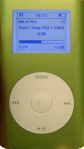
iPod Wheel
For those of us who remember the iPod, one of the most iconic aspects of the device was the clickwheel. There were multiple iterations of the design but my favourite was the Mini which I had in high school:
While functionally this was going to remain a picker component, I wanted to somehow incorporate the look of the iPod wheel. In trying to picture how this would work, I also realised it would be an interesting technical challenge as well.
The initial list of features I thought were important:
- It should be big enough so one doesn't have to aim too much (which is a big drawback to the original +/- picker)
- Haptic feedback
- At least as fun to use as it is to build
That last point was supposed to be my persona guardrail so I don't spend too much time on it, but more on that later.
Iteration 1
The first version was just a couple of circles and basic math for handling touch events. It was enough to get a feel for how this may work within the app and also it helped me refine the look and feel.
- The touch area needed to be bigger
- The rotation logic required more work so it feels more connected, like the finger gesture is actually responsible for the changes in the playlist size.
- After a while of playing with it, I also wanted to give it a different visual flair. Like what if the iPod wheel was made in 2026?
Iteration 2
How cool would it be if the component were based on a spring mechanism? It always returns to initial position and changing the values feels like winding up a toy.
I also made the touch handle a lot bigger, giving it colour and a visual response when pressing the component for the first time, as well as a bit of a bouncy entrance when the sheet first opens.
Iteration 3
Remember how one of the goals was not to spend too much time on it? It turns out, there are a lot of things you can do with a wheel-like control so I spent almost the entire weekend refining the physics of it and adding some extra features.